ProfesDyC
Professor reviews by students, for students — a web platform where the next intake picks its courses on something better than hearsay. Designed and built end to end.

A web platform where students at my university rate their professors and publish the reviews, so everyone else can choose a course on something better than hearsay.
The problem.
Students at my university had no reliable way to find out what a professor was actually like. The only option was word of mouth from friends, so people enrolled in courses with no insight into how they were taught — and often picked the instructor who suited them least.
The solution.
A platform where students rate professors and publish their reviews, so the choice is made on peer feedback: which teaching styles match how you actually learn.
Research.
I went through the platforms already doing ratings and reviews, and read their features, their interfaces and their feedback mechanics for what was worth taking and what was worth avoiding.
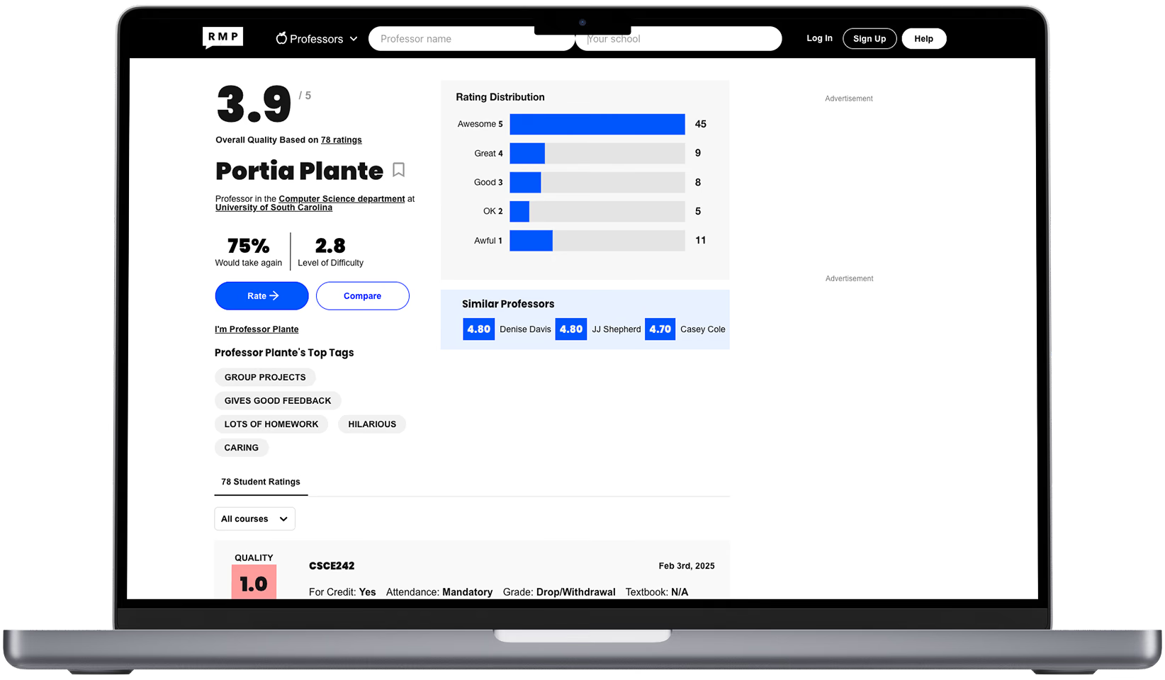
Rate My Professors
A web platform where students rate and review professors to help others make informed academic choices.
- Professor searching system
- 1–5 rating scale
- Rating average
- Written reviews
- Rating distribution
- New review form
- Tags system
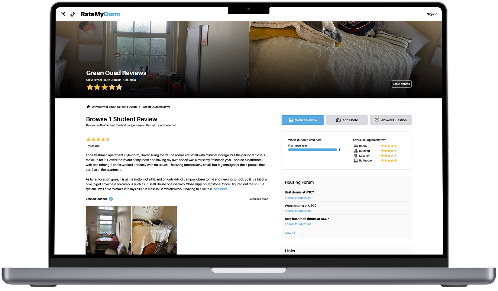
Rate My Dorm
An online platform where students rate and review their college dormitories.
- Dorm searching system
- Stars rating system
- Dorm submitting form
- Dorm general stats
- Top 5 best rated dorms
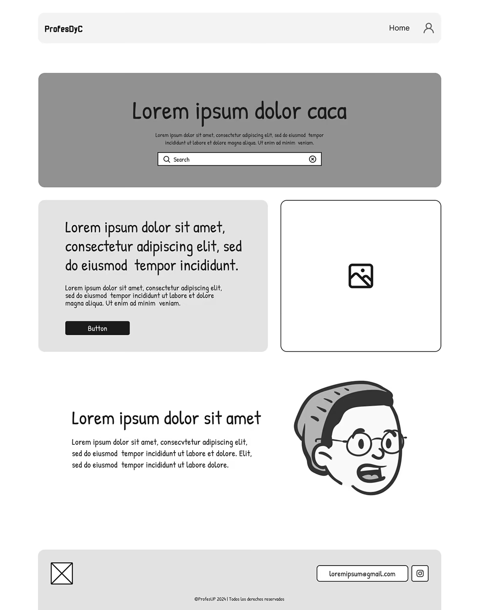
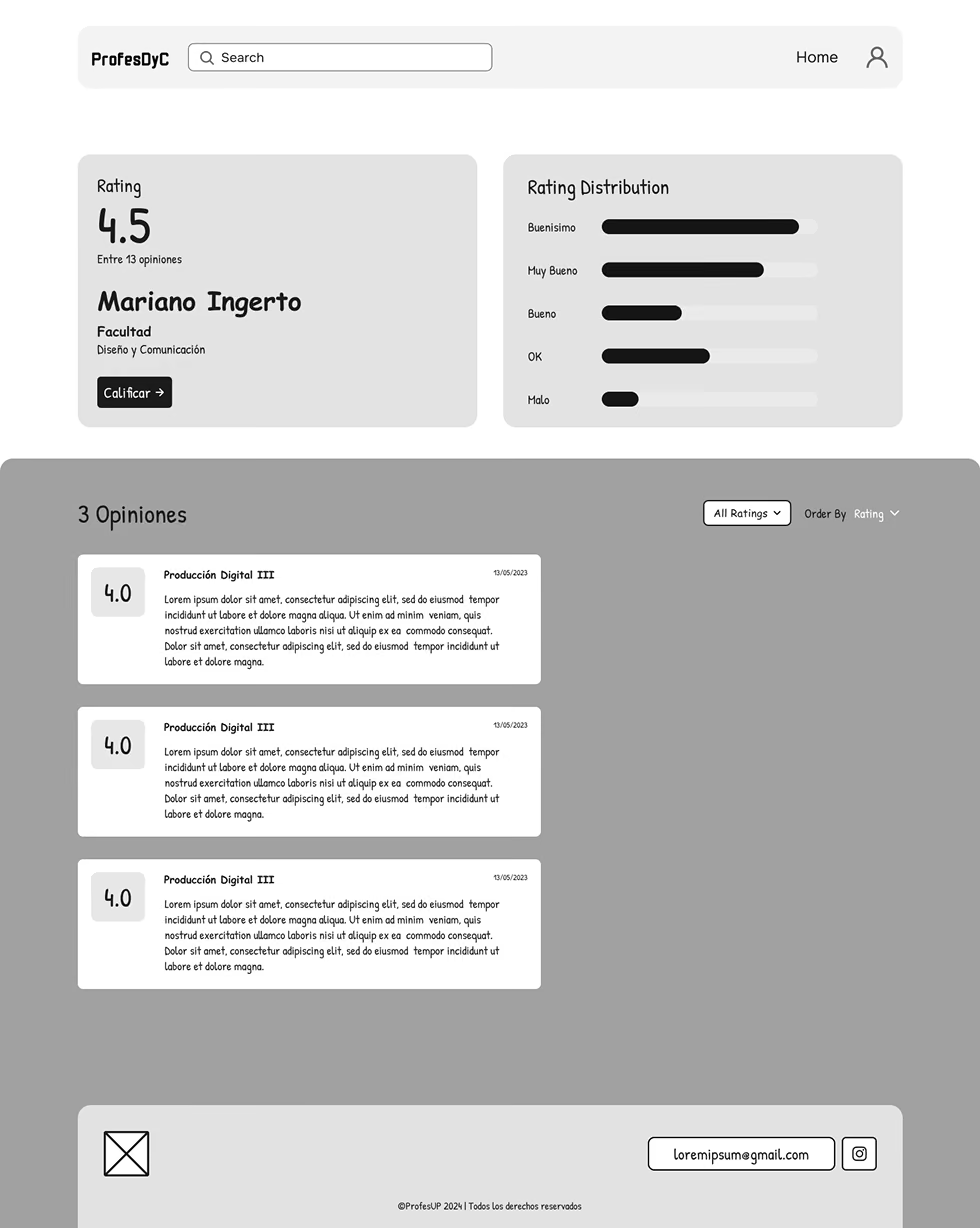
Wireframing.
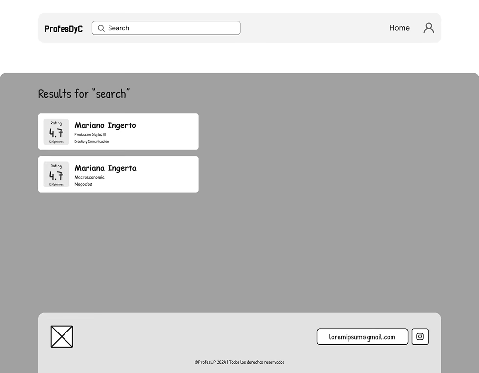
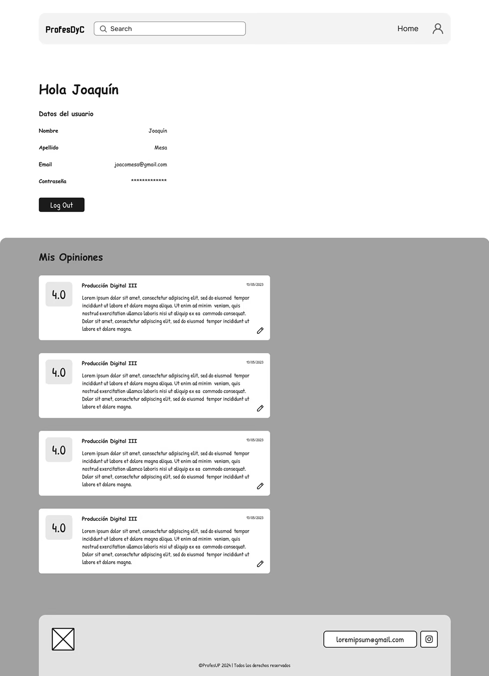
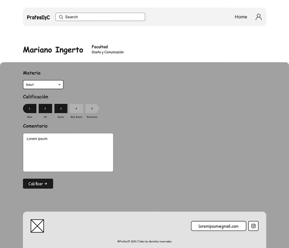
Every page of the site drawn in Figma first. Tweaking and refining the wireframes is what turned the research into a structure the design could be built on.



UI design.
With the structure settled, the visual design: type, color and components pulled into line with what the platform is for.
UI kit.
One typeface, one purple ramp, and a logotype built from the same squared-off shapes as the interface.
- Regular
- Semibold
- Bold
Development.
Then I built it. The UI became a working platform — students can search a professor, read what other people wrote, and leave a review of their own.
- Next.jsFront end and API in one codebase
- TailwindStyling, and the responsive work
- TursoDatabase